Design Strategy I Please scroll down to review strategy I Please click next arrow to see images
SERVICES RENDERED:
New Product Naming + Primary Bottle Research + Illustrations + Logo Design and Copy creation + Brand Design Architecture
Packaging Design options + Competitive Analysis + Brand positioning + Alternative production cost options
DESIGN CHALLENGE:
BEAM SUNTORY aimed to develop a comprehensive brand strategy that would facilitate the expansion of a diverse range of spirits. The objective was to create a brand identity that encompassed a modern craft aesthetic and effectively communicated the values of authenticity, creativity, and experimentation. It was important to consider a product extension strategy that distinguished each variant while maintaining a cohesive family identity. The planned release would consist of a limited batch of spirits positioned at a premium price range, although custom bottles would not be initially pursued. Despite this, the craft market continued to grow, making the premium, crafted segment an appealing market for Beam Suntory to enter. Consumers in the craft market increasingly sought authenticity, desiring genuine information and non-fictional narratives. This presented an opportunity to launch a new brand that resonated with Beam Suntory's chosen approach and aligned with their corporate identity in an authentic manner.
GOALS AND BRIEF:
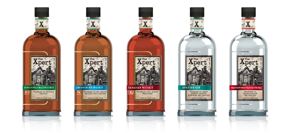
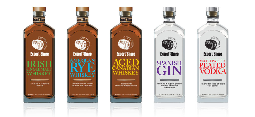
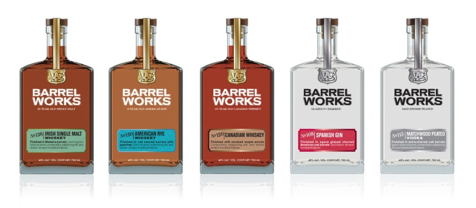
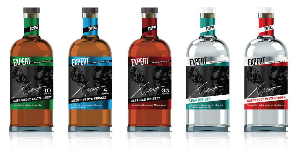
The design should clearly communicate that it is an umbrella brand aimed at commercializing new premium liquids. These base liquids will vary across categories, ages, and other characteristics, but they will all share the common trait of being premium and having undergone different wood treatments. At any given time, only a small number of products will be available, with potentially 1-2 being permanent or consistently available as the core offerings, while others will be limited releases based on availability. While they may be displayed together on a back bar in on-premise settings, they are unlikely to be shelved together in retail stores. Therefore, each product should have the ability to stand independently at retail.
To optimize the budget, it is necessary to source three stock bottles that can accommodate all varieties of the brand.
BIG IDEA AND SOLUTION:
I explored three different design approaches, each with its own unique name and visual representation, while ensuring authenticity and premium appeal. Glass bottle weights and special finishes were incorporated into the packaging to convey a sense of luxury. The design architecture was created to allow for easy modification and extension to different spirits without compromising the brand hierarchy.
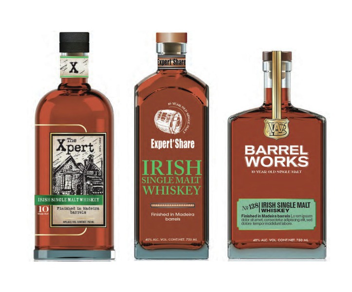
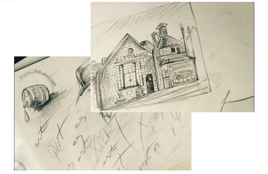
In the first approach, the focus was on expertise rather than experimentation, resulting in the name "XPERT." The design included a subtle character in the background that could relate to the personality of each liquid. Additionally, a distinctive distillery illustration was incorporated to emphasize the brand's unique and artisanal heritage.
The second approach centered around the concept of limited batches and highlighted the importance of barrels in the aging process. This led to the name "BARREL WORKS," accompanied by a shield design that added a signature touch.
For the third approach, I combined elements from the expert and limited batch concepts, resulting in the name "EXPERT'SHARE." The logo was designed as a barrel, and the years were accentuated to signify the aging process and emphasize the quality of each liquor.
Overall, these three approaches offered distinct branding options, allowing for versatility and the ability to communicate the unique characteristics of each spirit.